Playtesting and More… Much More.

Hey everyone,

Sorry for the long pause between blog posts but these past few weeks have been crazy busy… Even busier than the previous post stated!!

So here’s a few things that the group has been up to this past week… Mainly finalising and polishing everything we currently have and getting ready for our hand in dates for Gotland Game Conference (GGC) and Swedish Game Awards (SGA).

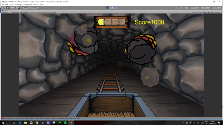
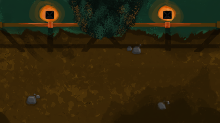
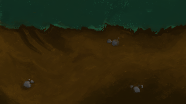
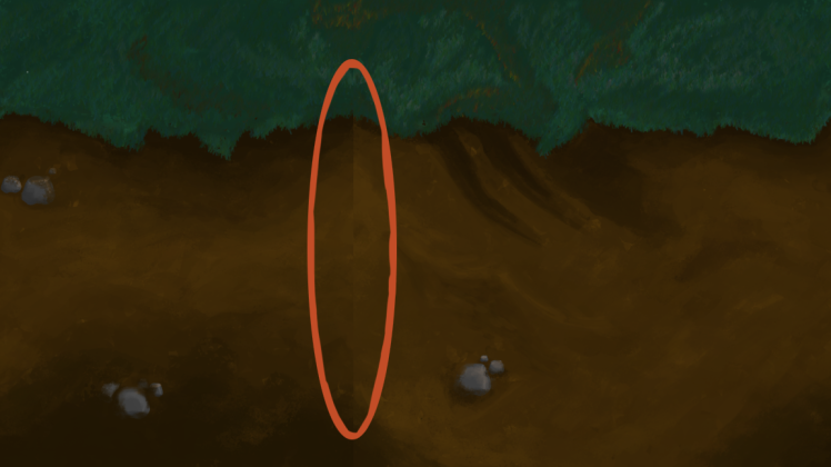
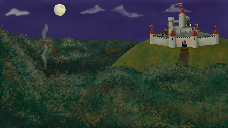
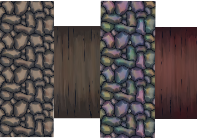
Our game has come on leaps and bounds into the 3D world and there’s been plenty of play testing from all walks of life to get some valuable feedback! We’ve added a bunch of new explorable areas throughout the mine cave and given the dull grey a revamp! Yes, the first colour you think of when it comes to stones and rocks is grey, but with so many different materials throughout caves there’s a huge spectrum of colours that we’ve implemented into the game to jazz up the environment. Here’s a comparison between earlier and later textures…

CaveComparison.png
Old cave texture on the left, new cave texture on the right.

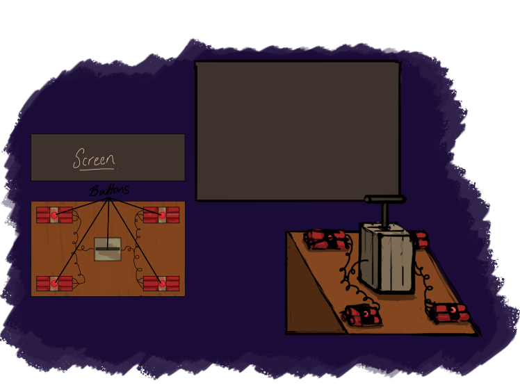
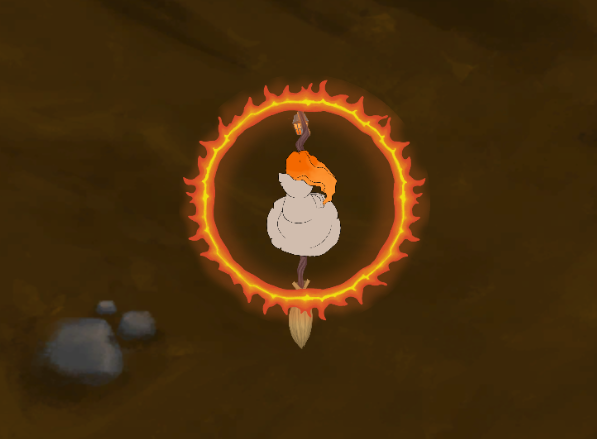
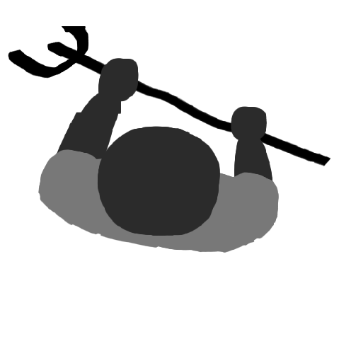
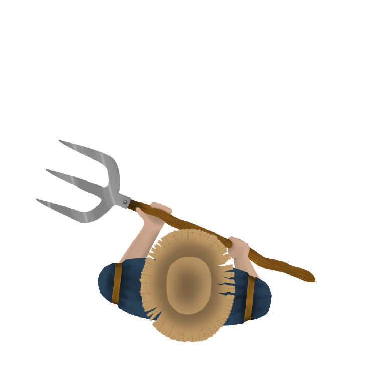
Our lead tech, Alexander, has also been diligently crafting our external input that we’ll be using for GGC. Alex first of all created a prototype out of cardboard and the buttons that would be used in the final build. It’s important to create the prototype first to see different people’s play patterns and how everyone would utilise the alternative controls board. Each arcade button has simply been mapped to a key on the keyboard that gets wired through an IPAC controller and then into a PC through a USB port. Basically, without all the technical mumbo jumbo… Our device can be connected to any USB port and be used in connection with our game. Here’s a glimpse at how our controller has been developing.

Team3.png
The first input in the very early stages of it’s workshop life.

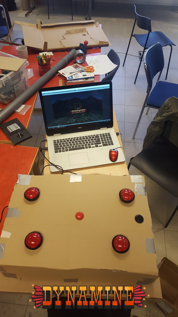
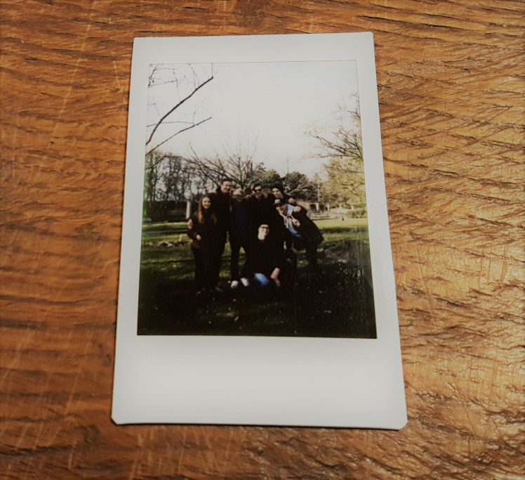
With this prototype we carried out some play testing. We took advantage of the peer play testing with the other students and gained some really valuable feedback for the 18-30 age range. We monitored how the player’s interacted with different aspects of our build, including tutorials, ‘Gold Rush’, the controls them selves and other smaller features. However, with us striving to cater to as many different age groups as possible we also took our game and input to CoderDojo. CoderDojo is a youth activity group for families to attend to help enhance their child’s programming skills. The children that attend on a bi-weekly basis use programmes such as scratch and Unity to start off the game-making enthusiasm (Check the Facebook link below). With the children attending these workshops being between the ages of 8 and 15 this was another key age group to target and test our game on. Even a few of the parents had a go. Once again the feedback we gained went straight into the product backlog and we began working on enhancing the weaker aspects of our game.

20170518_111252.jpg
How the input is turning out nowadays… Alex isn’t just a pretty face eh? 😉

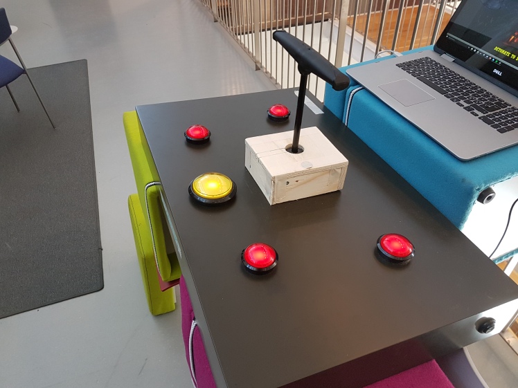
We’re currently testing with our new and shiny input to make sure all bugs are ironed out for the SGA this upcoming Friday. Yes. It is currently 1am on Friday morning. We know…

We’d also like to give a HUGE thank you to any of you that have played our game during development, your feedback has been invaluable! Feel free to have another go of an early build here…

https://drive.google.com/file/d/0BwPJmZJIfC1oRGNkbkV2NUhoV2s/view?usp=sharing

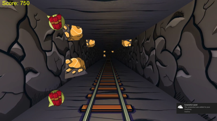
Controls are: DCKM to arm the dynamite then space bar to detonate and enter to use the gold rush or you can even use a game pad where the shoulder buttons arm the dynmite, right stick pulled down to detonate and A/X to gold rush.

External links mentioned throughout this post:

GGC – http://gotlandgameconference.com/2017/

SGA – http://www.gameawards.se/

CoderDojo – https://www.facebook.com/coderdojogotland/

and in case you missed it… here’s our own Facebook page connected to the game… Pictures and smaller updates get posted here.

https://www.facebook.com/DynaMineGame/?pnref=story

Thanks for reading and come back over the next few days for an update from Team Daemonocle!!

//Benjamin Lockwood: Lead Art.

Busy, busy, BUSY!

The Team Daemonocle production ship is currently firing on all cylinders! (minus this gloriously sunny first of May on the island). With the first of May coming around so soon we’ve been putting some hard working hours to get ready for the SGA (Swedish Game Awards) and the GGC (Gotland Game Conference) deadlines.

The programmers, Alex and Leevi, and our lead design, David, have been swatting those bugs in ‘Unity’ and keeping the DynaMine cart running as smooth as possible… There’s a few tweaks to be done still until our cart is ready for the next play testing on the 12th of May but they’re quietly confident that we’ll be stacking the gold in no time!

Related image
Leevi, our lead programmer when he gets hungry…

Mikael, our lead sound has been working diligently in his sound cave and we have some AWESOME music. Finally, with the help of the music programme ‘Elias’ he’ll be starting to piece together all the relevant sounds for our final product. Check our videos on our Facebook page (https://www.facebook.com/DynaMineGame/?pnref=story) and have a little groove to the tunes! There’s some other game music being cooked up but that’s under wraps for now! Keep in touch with the page to also see any new implementations when we have time to update our progress. David’s also been busy structuring our levels to fit along side our music to create a coherent design throughout.

With the agile methods being used in our production we’ve also switched most of our assets over to being 3D as the team felt that it makes the game look a lot cleaner than 2D sprites in a 3D environment. This has put a huge demand of the art side of project! With our producer, Marcel, having experience within 3D programmes such as ‘3DSMax’ and ‘Maya’ they’ve been moddling the 3D assets and supplying us artists, Elina and myself, with UV maps to texture  and get ready for implementation. With the correct mapping of each asset in the 3D programmes it’s easy enough to ‘simply’ add the colours!2017-05-01 (1).png

With Elina stepping out of her comfort zone with the 3D assets and normal mapping within ‘PhotoShop’, I’ve also been learning how particle systems work in ‘Unity’. Instead of using animations for the explosions, there’s been a conscious decision to use said particle system. It’s been a struggle but after using the YouTube channel ‘Making stuff look good in Unity’ it’s been a amazingly fast learning experience. I would recommend this channel for people of any experience to refer too if help is required.(https://www.youtube.com/channel/UCEklP9iLcpExB8vp_fWQseg)

With all this being said it’s time to jump right into the coming week! If you would like to play test our game at all and leave some feedback that’d be awesome! Just leave a comment or message the Facebook page directly!

https://www.facebook.com/DynaMineGame/?pnref=story

Thanks for reading and come back next week for any updates from Team Daemonocle!!

//Benjamin Lockwood: Lead Art.

DynaMine: The Beginning.

Hello, and welcome to the start of a new set of blog posts.

These following posts over the coming weeks will document our entire group’s work process for our arcade park game ‘DynaMine’.

For this section of the course we have been given the task to create a theme park game with an unconventional input device that we are to create/build ourselves. For this section of the there weren’t as strict guidelines for production. However, we knew as a group that we wanted to keep the gamerelatively simple as in order to not over-scope.

The previously formed group from ‘Burning Hunt’ (our game from the previous studies) stayed together, along with the addition of Mikael, the new sound guy! We have a great base to start from in regards to group dynamics and we’ve all been looking forward to this important project that could land us a spot on the floor of the GGC (Gotland Game Conference).

20170405_183249
Group photo!!!

With the beginning of any design process, for the first week, the entire group has been getting together on a daily basis and putting our minds together to create some awesome concepts. From the many concept ideas such as; mixing potions, cruising the high seas or petting life-like animals we discovered that a unanimous decision for creating a mine-shaft that you get to blowup yourself and steal the gold within came out on top.

During the process of iterating input devices and possible game play, the group created an extremely structured concept that we then went on to name ‘DynaMine’. Our high concept became perfect for an arcade game themed game: ‘You are a thief rushing through a mine shaft, tossing and detonating dynamite sticks to fill up your cart with gold’. There isn’t a finalised plan on how the player will be arming and detonating said dynamite but we have our input device concept complete.

Controls
The input device,


After finalising the concept document as a group there also needed to be other documents that needed focusing on before production began. These included the style guide and design document. Both of these documents will be imperative within the design process to keep us on track to create a solid and coherent final product.

As production is in the very early stage there’s not much more to show right now apart from a couple of screen shots of current in-game footage from the alpha build of the game. There has been some valuable feedback from the play testing and we must thank anyone that played our game once again.

2017-04-23 (1)
In-game screenshot.

There’s is still much more in the pipeline so keep watching this space or our Facebook page to see any development.

https://www.facebook.com/DynaMineGame/?pnref=story

Thanks for reading and come back next week for any updates from Team Daemonocle!!

//Benjamin Lockwood: Lead Art.

Shields made of FIRE!

So this week has been a week of crunching and getting all the pieces together to complete the big picture. ALL SYSTEMS GOOO! With the days closing ever so rapidly it’s time to get things finished up and have everything together for the final product… EXCITING!!

With this being a busy time I’ve been fluctuating between both, Unity and Photoshop whilst finishing off and implementing all the artefacts needed for the final game.

One of the main jobs that needed redesigning and implementing was the optional fire shield that the player could chose to use on the second level of your game. The simple placeholder for this was just simply a red circle that would encompass the player.circle

This wasn’t cool, we needed a new shield and we needed on fast. So that was this weeks first of many tasks that I’ve been working towards. The group wanted this to be an animation in game so I also had to create a few flames so create the illusion that the fire was ‘alive’ whilst surrounding the player when activated.

To make work flow faster I animated a quarter of the circle and the flipped/rearranged this quarter to create full circle animations frame by frame in Photoshop. I began by roughly sketching out some flames and filling them with the colours red/orange/yellow. After the roughly sketches i blended these colours whilst using a soft brush on low opacity to create a seamless blend on each frame. With a hint of glow each frame was complete. I then put these images into the sprite sheet packer, ready to implement into Unity.FShield SpriteSheet.pngWith the sprite sheet loaded into unity it was just time to simply split the sprites up into individual frames and replace the ‘red circle’ with the final fire shield animation. Overall, I was happy with the final input, below is a still of the fire shield being used in game. If i could change something regarding this shield I would put a pulsating glow onto the fire shield to give the flames more life when being used in game.

FireShieldPreview

There’s still plenty do this coming week before hand in but I think, as a team, we have everything pleasantly under control. Once the game is fully complete I will post a link here if you would like to download and try our finished product. But until then, wish us luck and we shall catch up again soon!

Thanks for reading any of the previous posts and I hope to see you in the next project’s blog… The Theme Park task!!

The Rolling Background.

So, things are starting to slowly come together with the BETA production hitting full steam with assets being implemented left, right and centre. The current pipeline mainly consists of polishing up sprites and taking on board any feedback received through play testing sessions to form a finalised product. With the team’s work coming together we’re starting to have a complete piece that’s taking shape.

One of the main production pieces that us ‘Amarok’ artists have been working on this week has been the background for the game within PhotoShop. For alpha purposes we had a simple mock that suited it’s purpose but we felt we needed something to fit the feel of our games coherency.

Background.png
Original background tile.

To make production as efficient as possible I split up the workload into two distinct features. I would do the stock background (the dirt track with the grass) and Elina would work on the assets that would rotate on the top section of the grass to depict where the player currently is within the level. This would include different styles of housing, trees, rocks and animals.

Through play testing and feedback we felt, as a team, that the proportions of grass and dirt worked well with what we wanted to achieve. With the dirt being the play surface and the grass + assets being only environment aspects, we needed to make sure that there was the correct amount of play surface for the player. Placeholders are awesome!!

So with ratios being perfect and Elina working on assets (check here for another awesome blog : https://elinamarjomaa.wordpress.com/author/elinamarjomaa/ ) it was time to get to work on the background…

First things first, let’s clean up this blotchy dirt and make it look a little more ‘realistic’. There was also some complaints during playtesting that the stones were also a little too big and were mistaken to be obstacles whilst flying so I decided to make them ‘melt’ into the dirt so players wouldn’t have any confusion whilst playing.

background-dirt-done
Here’s the dirt track in its final state.

Looking good! But the grass looks a little bit out of place right? The next step… To add some more ‘life’ into the grass I also implemented some temperature and saturation level changes so it didn’t look so flat.

background-dirt-and-grass-done
Never seen grass/dirt looking so awesome!!

Done! I was really happy with the result and within the game it really fits our style. Butttttt, when the artefact was implemented into the game there was a problem… You could see the line where the revolving tiles met.

Background 123 Blog.png
Where the tiles meet on revolution.

Someone noted that this took away from the immersion of play and recommended to use the ‘offset’ tool in Photoshop. This thing is MAGIC! You can simply apply the offset and blend the colours together at this point so create a seamless background! Hat’s off to Photoshop once again!

Once again, thanks for reading and watch this space for next week’s post!

GUI – Menu Design

GUI. Usually enunciated as ‘gooey’ and stands for Graphical User Interface. But enough of the technical talk, let’s get down to business!

The week’s tasks were to begin creating parts of the GUI for our game project. There was recently a group play-testing event and for this event we had basically implemented place holders for our menu for the player to actually be able to play, restart and quit the game. They looked terrible, but hey, that’s what place holders are for right? But, they needed updating to spice up the aesthetics of the game.

16933624_1759387047432659_627348892_n
The Place holder.

As lead graphics I made the decision to design a menu that contributed to the game play and to increase immersion into our 16th century world of fire and witches.To the drawing board! Or drawing pad in a literal sense but….

Sketches. I love sketching out ideas with pen and paper before moving onto digital art. So I began playing around with flames, torches and lanterns instead of letters but felt they became far too gimmicky. So i scrapped that. The next idea was to create a ‘plaque’ for each button whilst creating animations for each button when hovered over or clicked. A metal block, a Piece of parchment or a wooden block made it through the design process. Our power-ups are more than likely going to be parchment so that got axed, the metal block didn’t really fit our aesthetics so I decided that the wooden blocks would be perfect.

Placing wooden blocks onto a screen was a little too boring though. I came up with an idea to have separate boards for separate buttons that would then be linked in some way, like a hanging sign or something. Chains seemed a little to fancy for the era so I decided to go with rope instead. So here we have the standard menu sprite.

Menu Blank.png
Standard Menu without any animations.

Playing with the idea as fire for letters, I created a simple lettering design for each button. In turn, when hovered over by the player these letters will come to life with the illusion of being burnt or on fire. To create a stronger sense of the lettering coming to life I also added some rim light to the rope that has been cast by the lettering.

opening-menu
For some reason frame 2 is bugged when I upload into WordPress… But you get the idea 🙂

Next up is to possibly create an animation for when the player is clicking on each button. It’s not fully decided yet but the possible choice is to have the button ‘burn up’ into charcoal but there have been no final decisions made.

Once again, thanks for reading and keep posted for next week’s antics.


Animations – The Farmer.

With the game design getting into full swing it was time to get into the core game play of the game. We’d previously received a concept that we’ve been studying over this last week and come up with our own ideas to suit our visions. A glorious road ahead of us filled with Knights, Assassins, Kings and FIRE! But… I had to start somewhere with the enemy animations right? There’s no better place to start than at the bottom, with the humble farmer, our basic enemy type that will appear throughout the game.

The perspective of our game will be top down so enemies need to be highly distinctive to the player, this includes clothing, items and attack patterns. As a group, we came to the conclusion that the farmer would be most distinctive wearing a large straw hat with his/her weapon of choice being a pitchfork.HatAndPitchfork.png

As the only animation in Photoshop I had never done was a bouncing ball, all this animation business was completely new to me. With the help of lectures and the good old trusty YouTube, I feel highly accomplished with my final result.

I began by mapping out the basic rotation of frames I wanted for my walking animation. I did this by creating an array of grey blobs, each on its own separate layer and fiddling around with their positioning until I was happy with the result between each frame. Here is the outcome of my blob man…walky

The outcome was AWESOME… Well, maybe not awesome but feast your eyes on my first EVER humanoid animation! It felt really enjoyable and rewarding creating this sprite, it actually looks like a walking humanoid from top down which gave me a huge sense of pride. Yeah, okay, its some blobs that turned into an animation, but, it was just the beginning. Of course, We couldn’t implement this into the game project and leave it as it is so I began working on adding extra details to my animation. With adding the farmer’s clothing, hat and pitchfork the animation began to come to life, here is the final result…farmer-walking-animation

With our new farmer implemented into the game I used the same process to create an attacking animation and a death animation. Overall, I really enjoyed working on this piece and I’m really happy with the outcome! Here are the attack and death animations…

Once again, thanks for reading and keep tuned for the next post!

Creating Concept Art.

So, first things first, starting with creating concept art that would be appropriate to the given era and setting of the game.

The game document we chose, as a group, was ‘Burn Witch, Burn’ and was set in the heart of Scotland around the 16th century when witches were still at large.

For the first week, among other tasks, I took the task of creating concept art for the setting of our game. This began by researching different aspects of life at this time to help influence any choices regarding the design, such as; castles, buildings,clothing, lanterns/torches and even trees. This helped to gain an insight into the possibilities of the culture and environment of the time.

Within the game design document there were three main areas for the setting of the game, A castle, The woods/village and the antagonists home. I wanted to try and incorporate all these scenes into one image therefore I created a landscape with all of the above. The castle on the brow of a hill, for strategical defence purposes, the woods surrounding the hill and with the cabin in the woods which would orchestrate the antagonists dwelling.

As it would be the main focal point in the setting I wanted to focus on the different aspects of the castle. The majority of the castles I found to be useful whilst researching had these cone shaped roofing at the top of turrets or towers. I then created an outer wall and incorporated these ‘cones’ into this final piece. With many housing and other buildings there was a distinct pattern of having a stone ground floor but then greeted by wooden-clad first and second floors. I couldn’t find any reasoning behind them being built this way but I felt they would be fitting if I could include them into my castle or the surrounding building within the castle walls.

With this only being concept art I didn’t want to put an extensive time into drawing every single tree but I mainly concentrated on using temperature and hue shifts to create an interesting and appealing setting. I also emphasised the light from the moon glowing onto the canopy.

As a whole I feel I portrayed a strong setting for the group to work around and help influence any of the work that they might be working towards. Below is the final piece that I designed after said research and thinking of possible directions of the game’s aesthetics.


concept-coloring
Setting Concept Art.